Rosemary Jane
label design
Rosemary Jane is a concept for a line of all natural and hemp infused body care products. It is intended to be sold in organic grocery stores like Central Market, Whole Foods, or Sprouts. The line features body washes and lotions, with body scrubs and oils to come. Made with skin loving hemp and rosemary oil, feeling good is easy with Rosemary Jane.
the challenge
Create a set of labels that is representative of the brand Rosemary Jane. The labels should stand out amongst competitors while showcasing the all natural and hemp infused aspects of the products.
ideation
I created mood boards to highlight three concepts I wanted this brand's packaging to focus on: minimal, all natural, and luxurious. The minimal aspect of the design should provides a clean and serious atmosphere. The all natural theme brings in a sort of hand made, small batch feel. And then the luxurious element should invoke that feeling of pride you get when you buy something that appears exclusive.


sketches
I started with sketches for the body wash line. I wanted to try out a range of minimal ideas and differnt shapes for the label.


label drafts: round 1
I turned a few of my sketches into digital drafts. I started to play with some type choices and experimented with different label cutouts.


label drafts: round 2
I settled on a main layout but was still playing with typography, colors and placement. Up until now, I was using a stock illustration of rosemary in a style I want to try to do. I created the first draft illustration for coconut and lemon.
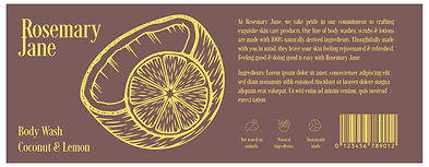


final label design

My final designs for the body wash lines each feature an illustration showcasing the scent of the product. I also designed this hemp oil tab that wraps around to overlap on the front of the label. I did this as I wanted to be able to highlight the hemp-infused aspect of this product without it coming off too weedy. Having it overlap creates a sort of hand-made quality that I think lends well to all natural products.


lotion bottle design
I translated these designs to a vertical format for the matching line of body lotions.


color & typography
I chose a typeface called Desire Pro for the Rosemary Jane brand. This typeface feels elevated and classy, which helps to envoke the luxurious element. This quality helps to attract consumers who might not typically reach for a hemp based product. For a secondary typeface, I chose Futura PT Condensed. This is a timeless, versatile font that creates a sense of familiarity.

I chose colors to coincide with the scents featured in the products. Each scent has a two tone pair. I considered contrast and legibility when choosing my color pairs.

illustrations
I created these three illustrations as simple depictions of the main scents in the products.
I also created a hemp illustration and these stylized icons for the label design.


the final product


reflection
Creating this project was valuable to my development as a designer. I had to be considerate about accessible color combinations, appealing to a niche market, and crafting a style across illustrations. I learned more about designing for a label and translating designs to different orientations. I would love to expand on this brand with creating material for other products, advertisements and social media assets.